ℹ️ Documentation
You can get support following the link to our Atlassian Service Desk.
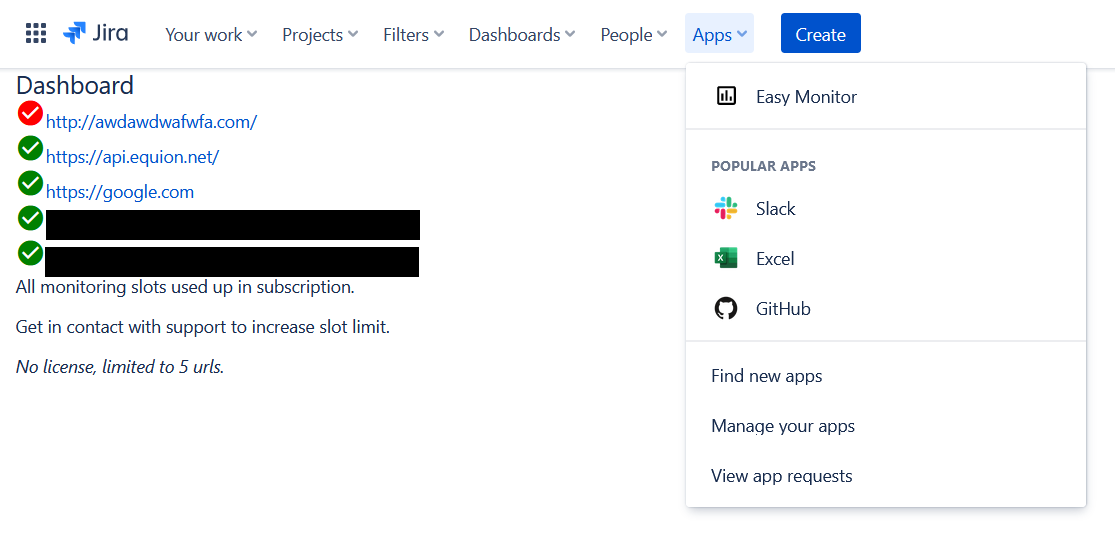
📕 Dashboard - Overview all your URLs
The dashboard shows all monitored URLs. A green symbol shows the URL endpoint is responsive, while a red one visualizes a service outage. A yellow symbol indicates a partial outage or degrading service performance.
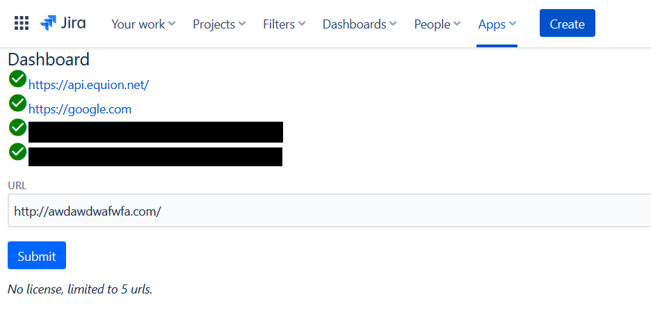
 Add URLs
Below the dashboard is a URL input field and a submit button to add an URL to be monitored. If you exceeded the URL limit, then the fields are hidden and a message is shown.
👀 View URL Health
The chart visualizes service latency. Large spikes indicate service outages. Below the chart, you can select a time frame to drill down into a narrow timeframe to see service latency in more detail.
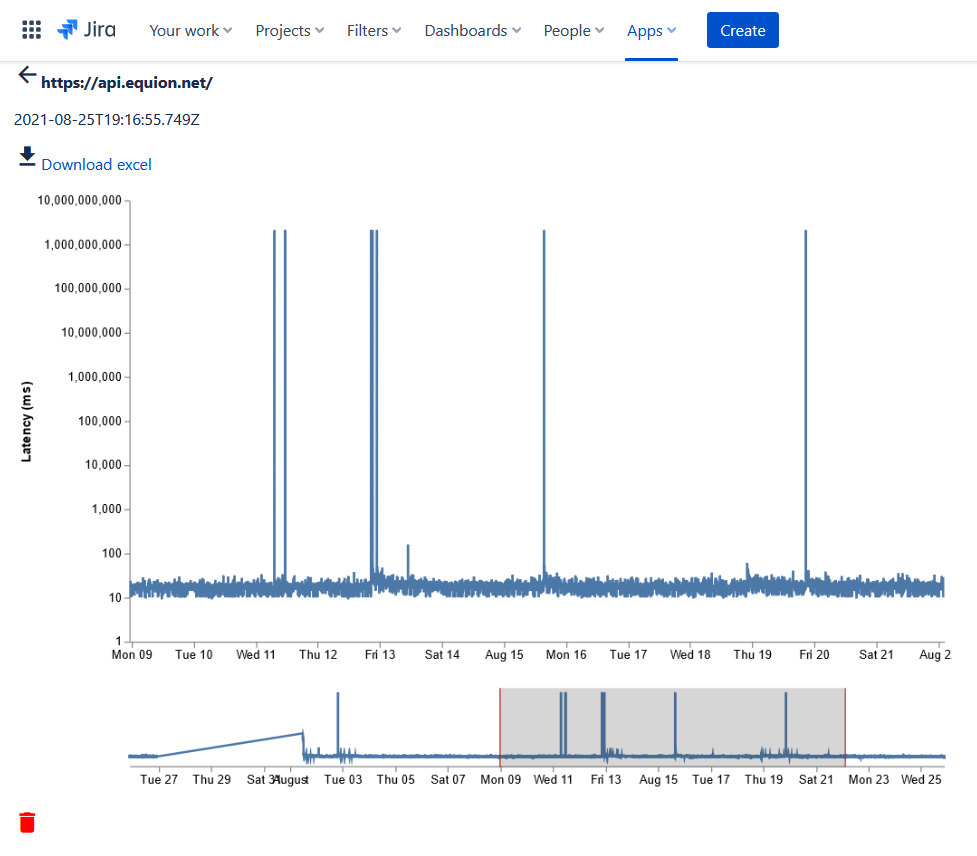
Download Monitoring Data as Excel File
Download all monitoring data via excel file by clicking on the Download Excel link in the health overview.
Remove URL
Remove an URL by clicking on the red trash symbol below the chart.